APPLE
Apple has fundamentally shaped how the world thinks about design and technology. Steve Jobs put it simply: "Design is not just what it looks like and feels like. Design is how it works." That philosophy — design and engineering inseparable — directly influences Team 1538's approach to brand identity. Every visual element is intentional, measurable, and purposeful. Nothing is arbitrary.
Apple's commitment to the intersection of technology and the liberal arts mirrors the team's belief that a robotics program is defined not only by its mechanisms, but by how it presents itself and creates a lasting impression.
Watch: Design is how it works — Apple

Apple Vision Pro
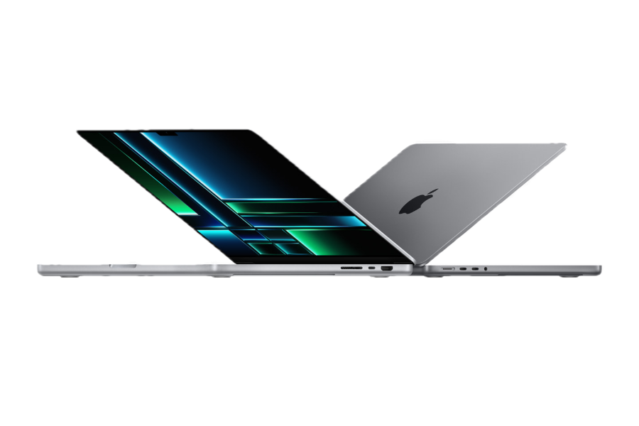
MacBook Pro
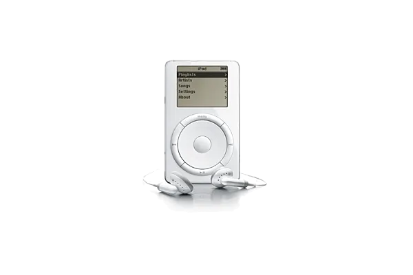
Apple iPod
DESIGN PHILOSOPHY
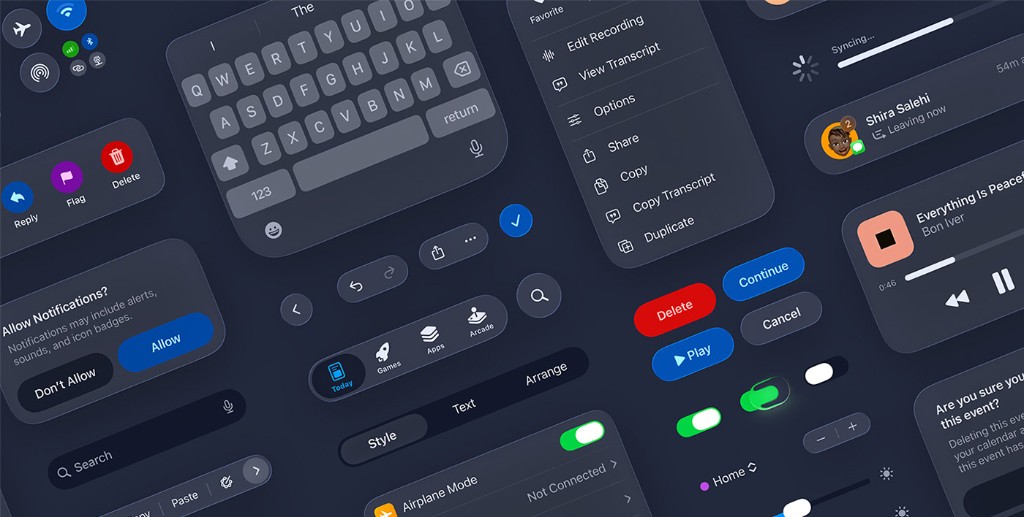
Apple's Human Interface Guidelines define a set of foundational design principles that govern every interface across the Apple ecosystem. These principles inform how Team 1538 approaches its own visual and communication systems.
CLARITY
Throughout the system, text is legible at every size, icons are precise and lucid, adornments are subtle and appropriate, and a sharpened focus on functionality motivates the design. Negative space, color, fonts, graphics, and interface elements subtly highlight important content and convey interactivity. For Team 1538, this translates directly — every visual element must communicate its purpose immediately, without ambiguity.
DEFERENCE
Fluid motion and a crisp, beautiful interface help people understand and interact with content while never competing with it. Content typically fills the entire screen, while translucency and blurring hint at more. Minimal use of bezels, gradients, and drop shadows keep the interface light and airy, while ensuring that content is paramount. Team 1538's brand standards follow this same philosophy — the design system exists to serve the content, not to call attention to itself.
DEPTH
Distinct visual layers and realistic motion convey hierarchy, impart vitality, and facilitate understanding. Touch and discoverability heighten delight and enable access to functionality and additional content without losing context. Transitions provide a sense of depth as you navigate through content. For Team 1538, depth is expressed through deliberate typographic hierarchy, layered information architecture, and consistent spatial relationships.
CONSISTENCY
A consistent interface uses familiar standards and conventions for icons, text styles, terminology, and behaviors so that people can navigate across platforms and apps with ease. Components and interactions look and work the same in every context. Team 1538's brand standards serve an identical function — a unified system of typography, color, and layout rules ensures every communication reinforces the same identity.
ACCESSIBILITY
Apple requires VoiceOver support, Dynamic Type implementation, color contrast ratios of at least 4.5:1, alternative text for all meaningful images, and minimum touch targets of 44x44 points. Accessibility is not an afterthought — it is a design requirement. Team 1538 applies this mindset by ensuring brand materials maintain strong contrast, legible type sizes, and clear visual hierarchy across all formats and viewing conditions.
DIRECT MANIPULATION
The direct manipulation of onscreen content engages people and facilitates understanding. Users experience direct manipulation when they rotate the device or use gestures to affect onscreen content. Through direct manipulation, they can see the immediate, visible results of their actions. For Team 1538, this principle translates to designing materials and experiences that feel tangible and responsive — whether a physical pit display or an interactive digital resource.
DESIGN RESOURCES
Official design templates, UI kits, icon production templates, product bezels (iPhone, MacBook, iPad, Apple Watch), and color guides for iOS, macOS, watchOS, tvOS, and visionOS.
Apple's comprehensive design guidelines covering layout, typography, color, icons, and interaction patterns across all platforms.
A library of over 6,900 symbols designed to integrate seamlessly with San Francisco, the system font for Apple platforms. Available in nine weights and three scales.