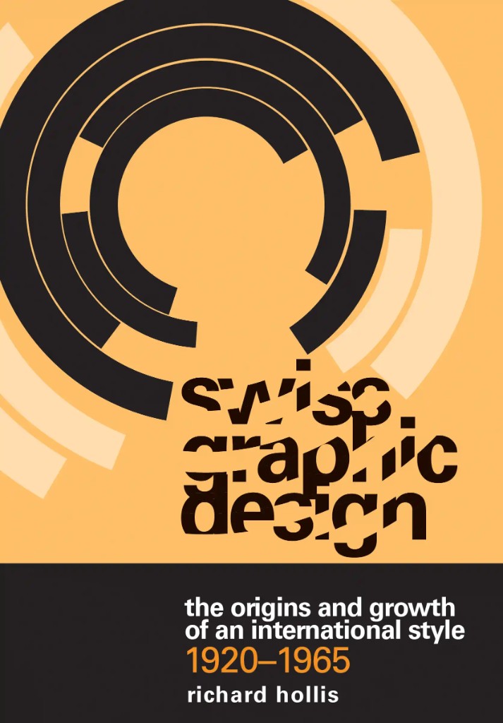
INTERNATIONAL STYLE
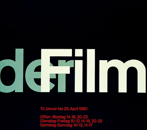
The International Style was born during the 1920s in Switzerland. It wasn't until the 1950s that the style began gaining popularity globally. The style is known for using grid systems to create clean and organized layouts. In addition, the use of sans-serif fonts contributes to the clean and crisp appearance of the style.
Team 1538 applies these principles throughout its design standards. The team's typographic system relies on sans-serif typefaces and grid-based layouts across publications, pit displays, apparel, and digital materials. A disciplined approach to line weights—bold or thin, with no mid-range ambiguity—and an emphasis on readability, white space, and asymmetric composition keep the visual identity clear and purposeful. In this way, the International Style reinforces Team 1538's identity as precise, intentional, and engineering-driven, where design serves communication above all else.
Watch: Swiss International Typographic Style
Readability
A defining feature of the International Style is readability. Critical information is presented free of distracting elements, making it easier for the audience to read and understand. In practice, this means clear typographic hierarchy, purposeful type choices, and removing visual noise so the message takes priority.
White Space
A hallmark of the style is the use of empty space (white space). Pages with very little white space can appear cluttered and detract from content, while appropriate white space gives pages elegance and professionalism. White space creates visual breathing room and guides the viewer's eye, reinforcing structure rather than leaving voids.
Asymmetry
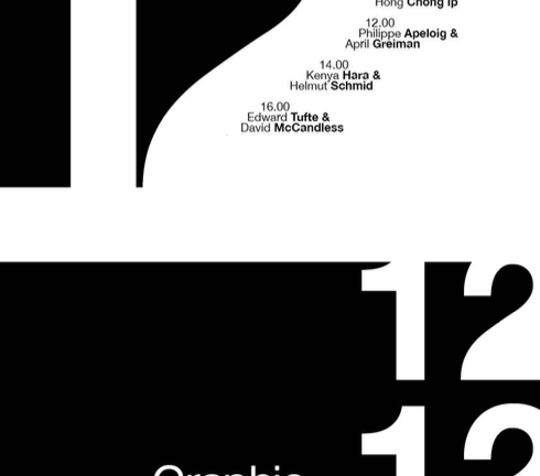
International Style layouts are typically asymmetric. Text is usually aligned left or right, regardless of position on the page. Centered text is rarely used in this style. Asymmetric compositions create visual tension and energy, making layouts feel dynamic while still maintaining order through the grid.