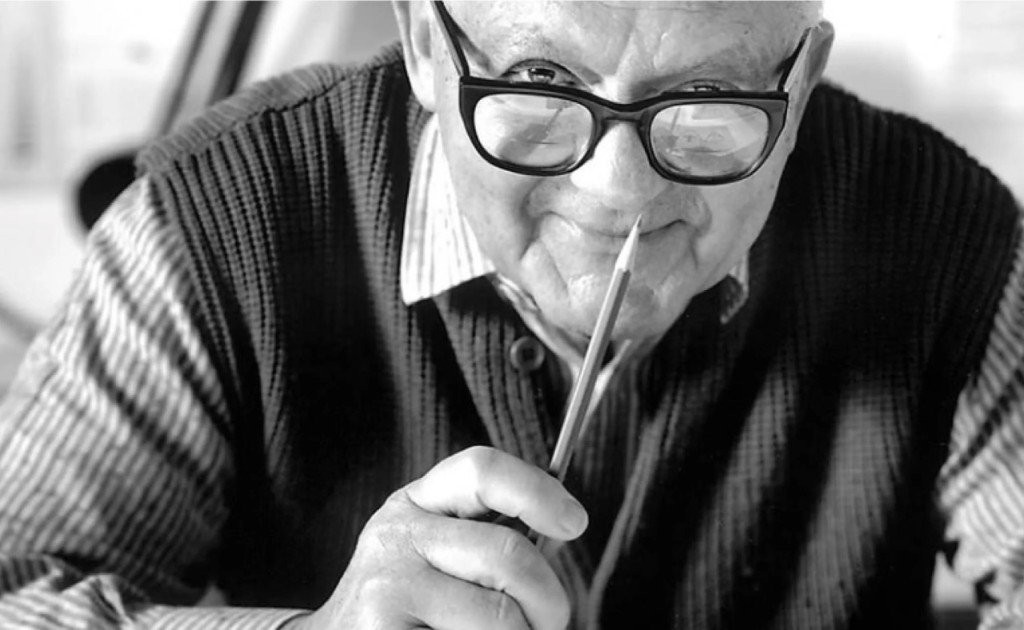
PAUL RAND 1914-1996
Paul Rand was one of the most influential American graphic designers of the 20th century and a foundational figure in modern corporate identity. He believed that design was not decoration, but a disciplined form of problem solving rooted in clarity, restraint, and purpose. Rand rejected trends and visual excess in favor of simple, durable ideas whose meaning is earned through consistent use and the quality of the organization behind them.
Over the course of his career, Rand created enduring identities for organizations such as IBM, UPS, ABC, Westinghouse, NeXT, Enron, and Morningstar—many of which remain in use today with little modification. His work demonstrated that a logo's primary role is to identify, not to explain or sell.
This philosophy directly influenced the development of Team 1538's logo. In the spirit of Paul Rand's work, the logo was designed to function as a clear and confident identifier rather than a literal representation of robotics or competition. Its strength comes from simplicity, consistency, and long-term use.
In alignment with Rand's principles, the Team 1538 logo prioritizes:
- Identification over explanation — the logo identifies the team without attempting to illustrate robotics or technology.
- Simplicity and restraint — the mark is bold, graphic, and easily recognizable across all applications.
- Meaning earned through use — the logo gains significance through the team's performance, professionalism, and consistency.
- Durability and timelessness — the logo is designed to remain effective across seasons, media, and generations.
By applying Paul Rand's design philosophy, Team 1538 treats its logo as a long-term asset—one that represents the team's reputation first, and its visual form second.
Watch: Paul Rand on design
IBM
Yale
ABC
NeXT
DESIGN PHILOSOPHY
WHAT A LOGO IS AND DOES
- A logo is a flag, a signature, an escutcheon.
- A logo doesn't sell (directly), it identifies.
- A logo is rarely a description of a business.
- A logo derives its meaning from the quality of the thing it symbolizes, not the other way around.
- A logo is less important than the product it signifies; what it means is more important than what it looks like.
"The Mercedes symbol, for example, has nothing to do with automobiles; yet it is a great symbol, not because its design is great, but because it stands for a great product."
— Paul Rand
EFFECTIVENESS OF A LOGO DEPENDS ON
- Distinctiveness
- Visibility
- Useability
- Memorability
- Universality
- Durability
- Timelessness